
Serve device-specific builds with Cloudflare and NextJS

In this post, I'll discuss how to serve different HTML files for the same URL based on the detected user-agent string. We'll use NextJS's static export feature alongside a Cloudflare page function to create a working example, which I open sourced here.
What it looks like
Here's the typical implementation that a client-rendered React application might use to render different screens based on device type:
import React from "react";
import Desktop from "./Desktop";
import Mobile from "./Mobile";
import useMobileBreakpoint from "@/hooks/useMobileBreakpoint";

const SomePage = () => {
  const isMobile = useMobileBreakpoint();

  if (isMobile) {
    return <Mobile />;
  }

  return <Desktop />;
};

export default SomePage;
But this approach means that the user will download code for both the mobile and desktop screens, even if they're only using one of them. The approach I outline below solves this by building and serving a different static assets for each target device type.
A build per device
Before I jump into the code, let's discuss the prerequisite technologies:
1) NextJS static export
Most developers are familiar with NextJS's ability to render React code on the server at request time, but NextJS also offers a way to render code at build time. The result is an output folder full of static assets which you can host on a wide range of hosting providers; no server logic needed (usually).
"The dream of the nineties" is still alive in 2023.
2) Cloudflare page functions
Cloudflare Pages is a static hosting provider that leverages a global CDN for lightning fast asset delivery to end users. That alone is powerful, but they also offer a way to programmatically intercept requests via an edge worker, called a Page Function. You'll need to use this to determine which assets to send to the user.
Github Setup
In Github, you'll need an empty repository to deploy a copy of the repo I created for this post. The repository you create must be empty. Do not create check the boxes to create a README.md or .gitignore file.
First, clone my repo:
## Clone and cd into the repo
git clone https://github.com/InterBolt/device-split-cf-function.git
cd device-split-cf-function
Next, install dependencies:
yarn
Then, setup your repo using the commands below. Be sure to replace REMOTE-URL with the url of the Github repo you created in the prerequisites section.
## Remove my .git folder and replace with your own
rm -rf .git
git init -b main
git add .
git commit -m "First commit"
git remote add origin REMOTE-URL
git push -u origin main
Cloudflare setup
You need to configure Cloudflare Pages to build a new static website everytime you push changes to your main branch.
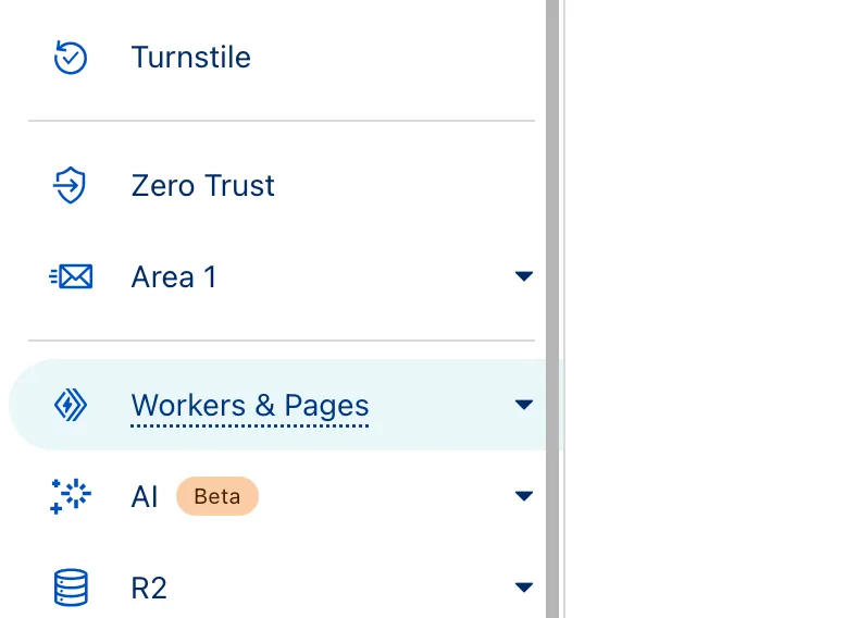
Navigate to your Cloudflare dashboard and click the "Workers & Pages" tab.
Then find and click on the "Create application" button. On the next page, click the "pages" sub tab and the "Connect to Git" button.
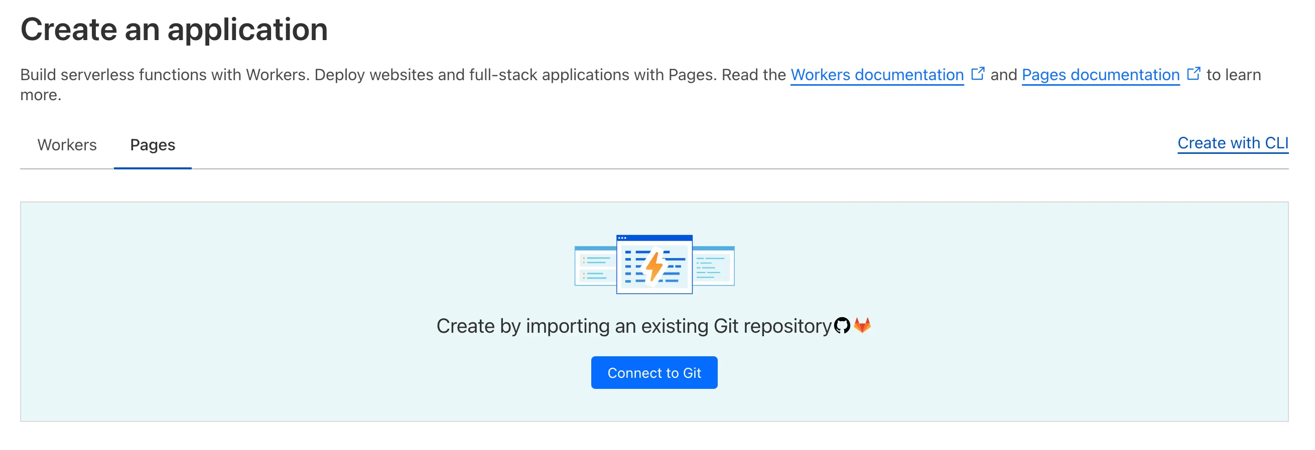
This will take you to a form to configure your github account and a repository. Click the "Add account" link to connect your Github account. Give Cloudflare Pages access to the repo created earlier. Once that's complete, you should end up back at Cloudflare. Make sure the repo is selected on this screen before clicking "Begin setup".
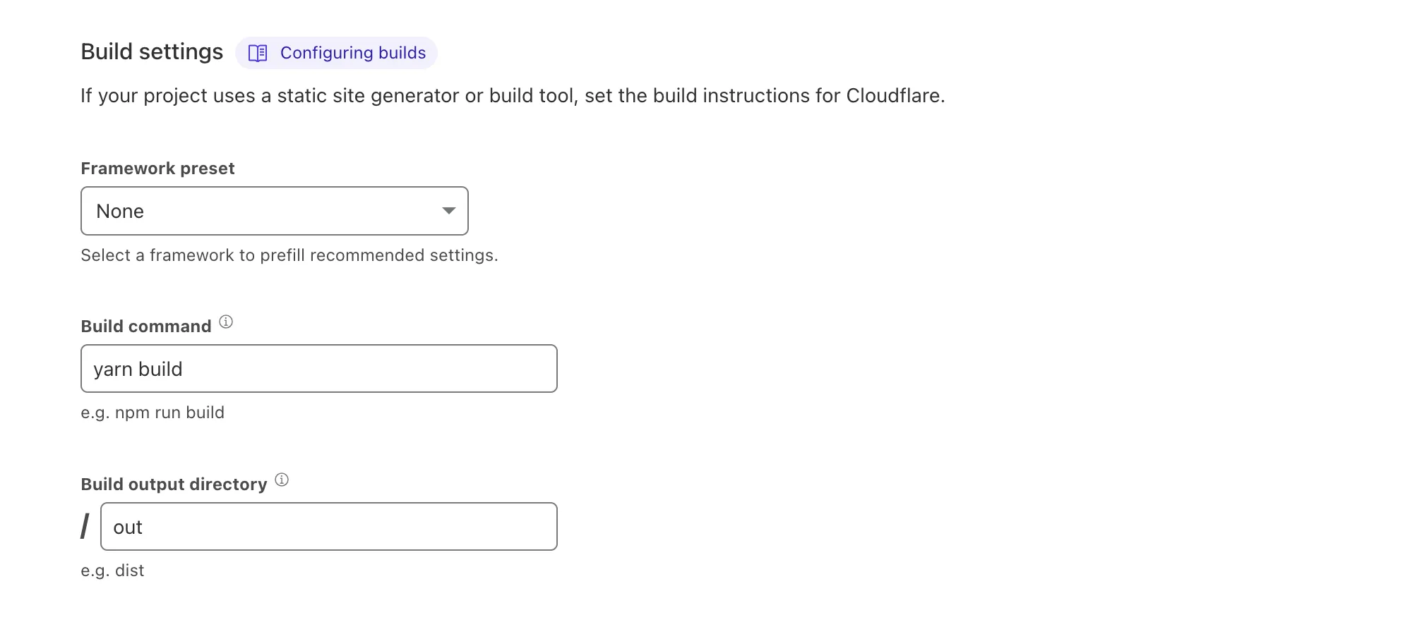
Next, configure the build pipeline by setting the Framework preset field to "None", the Build command field to "yarn build" and the Build output directory to "out". Your form should look like this:
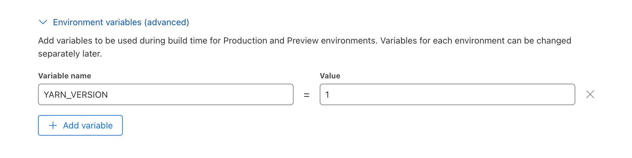
Next, in the same form, create an ENV variable by clicking Add variable and entering "YARN_VERSION" as the variable name, and "1" as the variable value. Your form should look like this:
Now you can submit the form and start your first build. Wait for your build to complete.
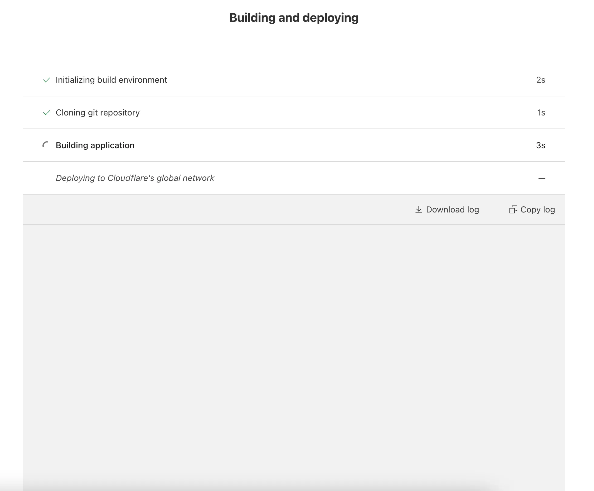
Once complete, Cloudflare will provide you with a url similar (but not identical) to this one: https://main.your-repo-9xh.pages.dev/. If everything worked, you should be able to click the link and see your new website. To see the user-agent detection in effect, compare the website on laptop and mobile devices.
Cloudflare monitoring
You can view the cloudflare page function logs by navigating to your new page's dashboard > Deployments > "View details" of the latest deployment in "All Deployments" > "Functions" tab > "Begin log stream".
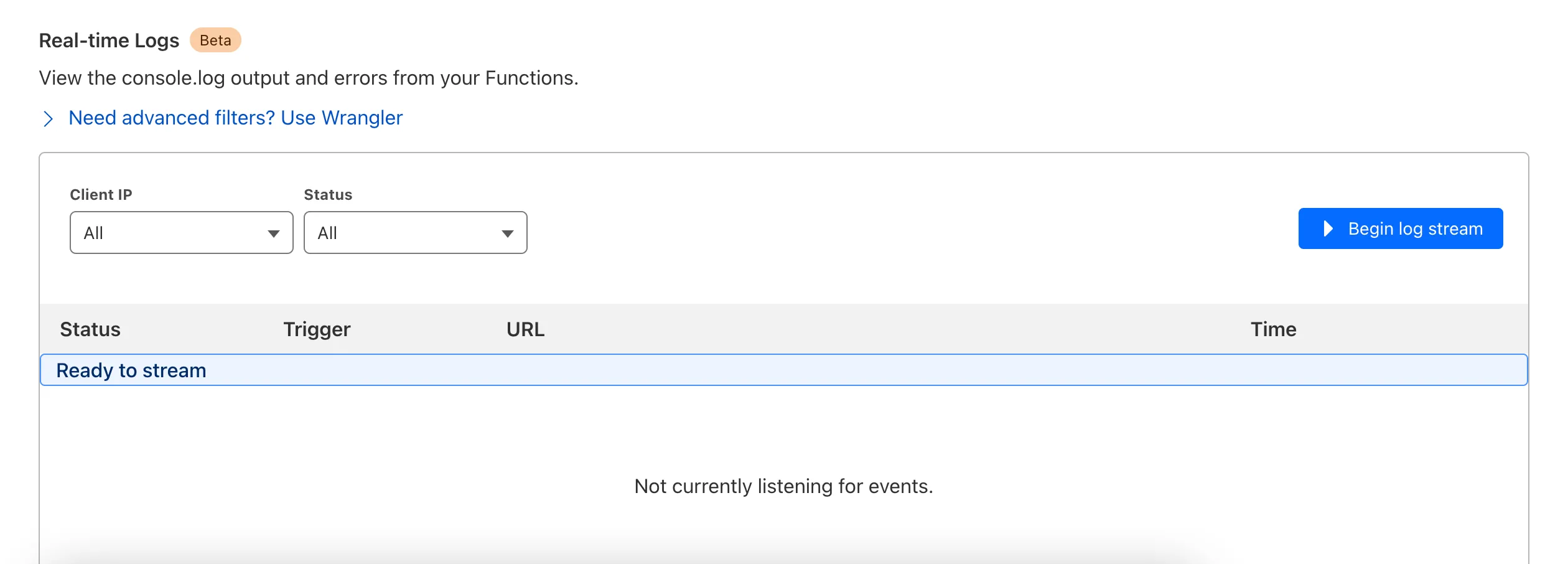
Open the link of the latest deployment and the logs will begin to show up. Note: each requested asset triggers the cloudflare page function to run.
Code Review: NextJS and build logic
In this section, I'll go over the code inside of the following repo, which you should have already downloaded and deployed to Cloudflare Pages. The relevant files in the repo are:
device-split-cf-function
├── README.md
├── app
│   ├── layout.tsx
│   └── page.tsx
├── functions
│   └── [[catchAll]].ts
├── next.config.js
├── package.json
├── scripts
│   ├── build.sh
│   └── deviceImports.js
└── src
    ├── hooks
    │   ├── useIsMounted.ts
    │   └── useMediaQuery.ts
    └── routes
        └── Home
            └── devices
                ├── desktop.tsx
                ├── mobile.tsx
                └── responsive.tsx
In the repo, you should have a barebones app/ directory (see NextJS app directory documentation):
app
├── layout.tsx
└── page.tsx
The layout.tsx file is a basic NextJS root layout. The important logic lies in page.tsx, which by default, renders a version of our website that includes code for both mobile and desktop devices.
// app/pages.tsx

import React from "react";
import HomeScreen from "@/screens/Home/devices/responsive";

const Page = () => {
  return <HomeScreen />;
};

export default Page;
The @/screens/Home/devices/responsive version of the home page only renders a screen after it mounts, and uses a breakpoint to decide which device screen to render:
// src/screens/Home/devices/responsive.tsx

"use client";

import Mobile from "./mobile";
import Desktop from "./desktop";
import useIsMounted from "@/hooks/useIsMounted";
import useMediaQuery from "@/hooks/useMediaQuery";

const Home = () => {
  const isDesktop = useMediaQuery("(min-width: 900px)");
  const mounted = useIsMounted();

  if (!mounted) {
    return null;
  }

  if (isDesktop) {
    return <Desktop />;
  }

  return <Mobile />;
};

export default Home;
But that's not really what we want. The purpose of this tutorial is to demonstrate how to build and serve code associated with only a single screen. To achieve that, we would need to import either @/screens/Home/devices/mobile or @/screens/Home/devices/desktop inside app/page.tsx instead. So for example, if you want to to build a mobile-only version of the site, your app/page.tsx file should look like this:
// app/page.tsx

import React from "react";
// CHANGED THIS LINE!
import HomeScreen from "@/screens/Home/devices/mobile";

const Page = () => {
  return <HomeScreen />;
};

export default Page;
The problem: manually changing the import path for each build is annoying and prone to error, and not something I would recommend doing for any non-trivial application. So I did something hacky: I wrote a node script called scripts/deviceImports.js that walks the app/ directory and modifies any line of code that includes the substrings: "from " and "/devices/". You can find the full script inside of scripts/deviceImports.js. Here's the general concept if you're in a hurry:
// scripts/deviceImports.js

const POSSIBLE_DEVICES = ["mobile", "desktop", "responsive"];
const DEVICE = process.env.DEVICE || "responsive";

// some code the define `modifyPageAndLayoutFileLines`
// ...
// ...
// ...

const isDeviceImport = (line) => {
  return line.includes("from ") && line.includes("/devices/");
};

modifyPageAndLayoutFileLines((line) => {
  if (isDeviceImport(line)) {
    line = line.replace(/\/devices\/\w+/, `/devices/${DEVICE}`);
  }
  return line;
});
Now that you have a way to automatically update imports on each build, you'd think everything would work as expected. But unfortunately, the multi-build approach breaks NextJS's internal prefetching logic. I don't care enough about pretching to solve this problem, so I opted to find a solution to disable it globally.
I had hoped there was a NextJS config option to do this, but no such option exists. Instead, there are two possible solutions: 1) write a babel plugin to set the prefetch prop to false on all NextJS Link components, or 2) wrap the NextJS Link to prevent setting the prefetch prop to anything other than false. The babel solution is clever but it locks you out of using SWC in the future. So I went with option 2 and created the following wrapped NextJS Link component.
// src/utils/LinkNoPrefetch.tsx

import NextLink from "next/link";

const LinkNoPrefetch = ({
  children,
  ...rest
}: Parameters<typeof NextLink>[0]) => {
  return (
    <NextLink prefetch={false} {...rest}>
      {children}
    </NextLink>
  );
};

export default LinkNoPrefetch;
I'm a stickler for DX, so to prevent you or any other developer from accidentally using next/link directly, I wrote a script that will throw if more than one next/link import exists in your React code. If you're always using a wrapped version of next/link, this script should never throw.
// scripts/throwOnNextLinkUsage.js

const path = require("path");
const fs = require("fs");
const { getAllFiles } = require("./_shared.js");

const pathToRepo = path.resolve(__dirname, "..");

const nextLinkUses = [];

const doCheck = (filePath) => {
  fs.readFileSync(filePath, "utf8")
    .split("\n")
    .some((line) => {
      const found = line.includes("from ") && line.includes("next/link");
      if (found) {
        nextLinkUses.push(filePath.replace(pathToRepo, "."));
      }
      return found;
    });
};

const isCodeFile = (file) => /\.(js|jsx|ts|tsx)$/.test(file);

getAllFiles(path.resolve(pathToRepo, "app"), isCodeFile).forEach(doCheck);
getAllFiles(path.resolve(pathToRepo, "src"), isCodeFile).forEach(doCheck);

if (nextLinkUses.length > 1) {
  throw new Error(
    `next/link should only be imported in a single wrapper file to prevent prefetch behavior. Found in files:\n${nextLinkUses.join(
      "\n"
    )}`
  );
}
Phew, that's a lot to take in. But with all of this in place, you can now run the script to build your application.
##### scripts/build.sh

#!/usr/bin/env bash

## Stop script execution if any command fails
set -e;

## Ensure that we don't use next/link directly
node ./scripts/throwOnNextLinkUsage.js;

## Create the base fallback build
DEVICE="responsive" node ./scripts/deviceImports.js
NODE_ENV=production ./node_modules/next/dist/bin/next build;

## Create builds per device
for DEVICE in desktop mobile; do
    DEVICE="$DEVICE" node ./scripts/deviceImports.js
    NODE_ENV=production BUILD_DIR="out/_$DEVICE" DEVICE="$DEVICE" ./node_modules/next/dist/bin/next build;
done;

## Reset imports for local dev
DEVICE="responsive" node ./scripts/deviceImports.js
The result of all of this: one minimal build per each device and another build that includes everything. The build that includes everything is used in fallback situations and includes the responsive import we had originally. But in most cases, our cloudflare page function will only serve the minimal device-specific builds.
If you decide to add more pages to the application, you should follow the current directory structure laid out in the src/screens/ directory to ensure the above build logic works as intended. So for example, to create a new page for a dashboard at https://youwebsite.com/dashboard, you should create three files, mobile.tsx, desktop.tsx, and responsive.tsx, under src/screens/Dashboard/devices/, and a app/dashboard/page.tsx file likeso:
// app/dashboard/page.tsx

import React from "react";
import DashboardScreen from "@/screens/Dashboard/devices/responsive";

const Page = () => {
  return <DashboardScreen />;
};

export default Page;
The new folder structure of the app/ and src/ directory will look like:
app
├── dashboard
│   └── page.tsx
├── layout.tsx
└── page.tsx
src
└── screens
    ├── Dashboard
    │   └── devices
    │       ├── desktop.tsx
    │       ├── mobile.tsx
    │       └── responsive.tsx
    └── Home
        └── devices
            ├── desktop.tsx
            ├── mobile.tsx
            └── responsive.tsx
And if you're wondering, this strategy works for layout.tsx files too. For example, if you have a root layout for each device at src/layouts/root/devices/, scripts/deviceImports.js will correctly modify the imports within the app/layout.tsx file (considered the "root" layout).
With the hard part of the build logic out of the way, the last piece of the NextJS portion of the repo to review is the next.config.js file:
// next.config.js

const DEVICE = process.env.DEVICE || "responsive";

/**
 * @type {import('next').NextConfig}
 **/
const nextConfig = {
  assetPrefix: process.env.BUILD_DIR ? `/_${DEVICE}` : undefined,
  distDir: process.env.BUILD_DIR || "out",
  output: "export",
  trailingSlash: true,
  env: {
    DEVICE,
  },
};

module.exports = nextConfig;
Firstly, the distDir option ensures that the tree structure of the out/ dir will look like this:
out
│   (...assets for responsive build here)
├── _desktop
│   (...assets for desktop build here)
└── _mobile
    (...assets for mobile build here)
Cloudflare Pages doesn't support uploading three separate out folders so we must nest device specific builds inside of our responsive build. In theory, if there are ever conditions where it makes sense to opt-out of serving device specific builds, all you'd have to do is modify the cloudflare page function (see next section) to skip modifying the request url on said conditions.
Lastly, the assetPrefix option ensures that assets are linked up correctly per build. Ex: if you serve the user the index.html file inside of out/_desktop/, any script or link tag hrefs should get prefixed with /_desktop.
To confirm that everything works as intended, try adding a heavy dependency and importing it in src/routes/Home/devices/desktop.tsx, but not in src/routes/Home/devices/mobile.tsx. You should see different build sizes when running yarn build.
Code review: Cloudflare Page Function
Creating a Cloudflare Page Function is surprisingly easy. All you have to do is create a functions/ dir and add some files. The name of the Typescript or Javascript files inside of the functions/ dir dictates which routes your Page Function will intercept. For the naming rules, see Cloudflare's docs. The cloudflare page function used to serve your different builds must run on each route, so it's named [[catchAll]].ts.
// functions/[[catchAll]].ts

import { getSelectorsByUserAgent } from "react-device-detect";
import { parse } from "npm-url";

const useNestedDir = (
  parsedUrl: { host: string; href: string },
  dir: "_mobile" | "_desktop"
) => {
  const { host, href } = parsedUrl;
  const modifiedUrl = href.replace(host, host + "/" + dir);
  return modifiedUrl;
};

export const onRequest: PagesFunction = async ({ next, request }) => {
  const headers = new Headers(request.headers);
  const { isMobile, isDesktop, isTablet } = getSelectorsByUserAgent(
    headers.get("user-agent")
  );

  const parsedUrl = parse(request.url);

  let nextRequest: Request = request;
  if (isMobile && !request.url.includes("/_mobile/")) {
    nextRequest = new Request(useNestedDir(parsedUrl, "_mobile"));
  } else if (isDesktop && !request.url.includes("/_desktop/")) {
    nextRequest = new Request(useNestedDir(parsedUrl, "_desktop"));
  }

  return next(nextRequest);
};
This code defines two functions, useNestedDir and onRequest.
useNestedDir: a helper function to modify the request url, which ensures Cloudflare serves the correct build.onRequest: a function that fires on each static asset request.
The most important section of the above code is the call to getSelectorsByUserAgent, which determines the device type that our requester is likely using.
const { isMobile, isDesktop } = getSelectorsByUserAgent(
  headers.get("user-agent")
);
getSelectorsByUserAgent comes from the react-device-detect library, which relies on ua-parser-js, and is normally used in React applications. I was already familiar with react-device-detect so I decided to not use ua-parser-js directly. There are better ways to do this that don't rely on a bloated React-based dependency; feel free to shoot me an email if you have suggestions. But for a proof-of-concept implementation, react-device-detect works just fine.
getSelectorsByUserAgent returns a ton of selectors btw, which makes it easy to create new build types if you wanted to:
isSmartTV
isConsole
isWearable
isEmbedded
isMobileSafari
isChromium
isMobile
isMobileOnly
isTablet
isBrowser
isDesktop
isAndroid
isWinPhone
isIOS
isChrome
isFirefox
isSafari
isOpera
isIE
isEdge
isYandex
isIOS13
isIPad13
isIPhone13
isIPod13
isElectron
isEdgeChromium
isLegacyEdge
isWindows
isMacOs
isMIUI
isSamsungBrowser
As your cloudflare page function (functions/[[catchAll]].ts) is currently written, it will almost always serve code from the out/_desktop/ or out/_mobile dirs, since react-device-detect's agent detection will return isMobile=true for both tablets and phones. But a tablet user's screen width changes dramatically between portrait and landscape mode, so it might be a good idea to serve your tablet users a responsive build, rather than a device-specific build. Try modifying functions/[[catchAll]].ts to make this work.
Run with wrangler
You already deployed this repo onto Cloudflare Pages in a previous step, but it's nice to test things out locally too. Cloudflare uses a CLI tool called wrangler to make this possible. Follow these instructions to setup wrangler, run yarn build (if you hadn't already), and then run your Cloudflare Page Function locally with:
npx wrangler pages dev out
Assuming everything worked, you'll see some urls in your console that you can open in your browser to test out your application. The files served via wrangler should respect your user agent device rules defined in functions/[[catchAll]].ts. Try opening the demo site locally using the browser's responsive inspection tool.
Conclusion
At the end of the day, there's several valid strategies to create a frontend tailored to multiple screen sizes or device types. Each strategy comes with tradeoffs, either for the user, the developer, or both. At InterBolt, our solution is similar to the one laid out in this tutorial, but includes some additional pieces that are out of scope for a blog post.
Hopefully the repo sparks some ideas for combining NextJS's static exports with Cloudflare Page Functions in other ways. If you have any questions or feedback please feel free to reach out to me at [email protected]. I'm always happy to chat about software engineering, or anything else. Thanks for reading!